


CLIENT PROJECT
TEAM OF 5
Mouse & Grape
Improving the user experience of buying a curated cheese and wine hamper from the Mouse & Grape desktop site by conducting user research, analysing results and prototyping new features
:

👁️ Overview
Mouse & Grape offers bespoke hampers to purchase directly from the website and is run by a cheese and wine pairing expert. We had two goals to focus on - improving hamper sales and upselling the add-ons.
🔍 Objectives
-
Identify pain points and usability issues in the browsing and buying processes
-
Learn from what's working well, examining positive aspects to reinforce, providing continued value to users
-
Improve the sales experience, by addressing the above issues to create a more user-friendly and intuitive sales process, improving sales and customer satisfaction
✅ Our Solution
After conducting user research, we focused on the three pages that we found to be key to the hamper buying experience:
1. The product listing page
2. The individual product pages
3. The user flow when adding items to basket
By addressing these areas of the site, we were able to prototype revised layouts and features to make a clearer user experience, thus selling more hampers and add-on products.
We faced the challenge of a two-week timeframe, so concentrating our focus to these key areas optimised efficiency.
🚀 Research
We conducted usability testing with a diverse group of participants, who were selected to represent different demographics within the audience specs provided by the client. Using a task-based approach and structuring the testing around these tasks, we aimed to simulate real-world user scenarios to evaluate the user journey, followed by post-task questions.
The interviews were conducted online and, when permitted, were recorded along with the participant's screen. Their interactions were observed and participants were encouraged to think aloud and talk us through their thought processes.
USABILITY TESTING
TASK-BASED APPROACH
OBSERVATION
NOTE TAKING
DATA ANALYSIS
(Names changed)
Participant Profiles:
Mel, 30s
Digital Marketing
Consultant
Andreas, 40s
CEO
Vasil, 40s
Security Manger
Harvey, 30s
Network Engineer
Sarah, 50s
HR Officer
Kate, 40s
Software Developer
Task 1: You need to buy a thoughtful & memorable gift for a friend who loves wine and cheese. Please visit the Mouse & Grape website and choose a hamper that you think would make a great gift.
Task 2: Purchase the 'Luxury Eliza Hamper' for a client with a personalised gift note.
Task 3: Explore the Mouse & Grape website to gather information about the company and their products.
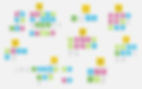
🏷️ Affinity Mapping
As part of research analysis we highlighted key points and quotes from each interview and collaboratively sorted them into groups so we could visualise the patterns.
This helped us establish clear aspects that could be improved on or altered to enhance the user experience.
(Image blurred for confidentiality)


🔑 Key Findings
We analysed and collated our research and data, revealing findings such as these...

After, we condensed our results into four key findings. Click through them below!
Lack of distinction between each hamper on the product listing page
"It would be nice to arrange products by price"
"I would like to see more about each product that's inside before I click"
-
Participants found it difficult to distinguish between each hamper
-
There was a general desire for categorisation
-
The testing revealed that participants required more guidance through the buying process


🧠 Wireframing & Prototyping Solutions
With the use of 'How might we?' phrases for each key finding, we collaborated on brainstorming and sketching potential solutions.
After group ideation we made some design decisions and from the wireframes I created a working prototype of the revised process of browsing and purchasing a hamper.

How might we make it easier for users to choose between hampers on the product listing page?
A reminder of the key findings...
-
Participants found it difficult to distinguish between each hamper
-
There was a general desire for categorisation
-
The testing revealed that participants required more guidance through the buying process
PREVIOUS PAGE DESIGN


WIREFRAMING
Ideation began with adding a brief description under each hamper, saying the theme and what is inside, to help customers differentiate. However, we found this to be too overwhelming, as users already expressed overwhelm with the amount of text.
We moved to the idea of a button leading to a drop-down menu, with more info, a brief description, and visual slider of what's inside.

We agreed the positioning of a drop-down menu may end up confusing people. So we came up with a pop-up 'quick view' screen, whilst keeping the visual slider. Ideally we would have done A/B testing here! But due to time constraints this wasn't possible, and we had to go with the gut feeling of the group members.
OUR REVISED DESIGN

We added filter menus such as seasonal filters for themed hampers (e.g., Summer and Christmas) and specific cheeses and wines, to address specific user wants.
Condensing the writing at the top allows users to quickly grasp essential details without the feeling of being overwhelmed with text
Adding a quick view pop-up after clicking on the hamper will help users gain a better understanding of the hamper contents, differences and purpose, before entering the in-depth product page, allowing for quick comparison

Adding a sort-by menu for ordering hampers by price or popularity will address user needs for a more efficient selection process
An alternative solution to this is having a brief description of each hamper under the name
New images so the hampers are more differentiated, showing the cheeses unwrapped
Creating a close-able bar with a link to sign up for the mailing list brings more attention to it, rather than just having the section at the bottom which most of our participants missed

ANIMATED PROTOTYPE

How might we improve the experience of the individual product pages for the user?
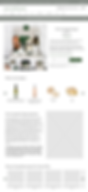
PREVIOUS DESIGN

A reminder of the key findings...
-
Participants found the provided photo insufficient to properly identify all the items included. They expressed a desire for a clearer display of the products
-
Feedback indicated that participants found the text at the top of the page overwhelming and wished for a more concise and organised format


Our initial thoughts were to simply re-arrange the page to get rid of the white space. Instead of having an overload of text on the right, just having a brief hamper description with what's inside, and moving a more in-depth description further down.
To address the visual needs of users, we considered the idea of new photos showing exactly what's inside, with items clearly labelled.
We also considered adding these items as a visual labelled list underneath the photos in a 'Whats inside?' section.
We thought this would then just extend the page even more, rather than condensing it, so we decided to keep the visuals of each item but on an interactive scroll list. This way we are addressing user needs for a clearer display of products, and also the need for a more concise format.
WIREFRAMING
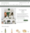
REVISED DESIGN


We added visible imagery of the products within the hamper as a scroll list, so users can better understand the contents and make informed decisions

We added quick links within the top section of text. These link to other sections of the page to guide users efficiently through the content. By clicking '13 items inside' you're taken down to the scroll list of items. By clicking 'More about the Esmerelda Tasing Experience' you are taken to the in-depth text further down the page. This method provides essential information in the top text whilst not overwhelming the user with text, and these links can lead users to relevant sections further down the page if they wish to read more
Live Google reviews - the company has great Google reviews, so showing these from real customers will give new users re-assurance
ANIMATED PROTOTYPE

How might we draw the user's attention to upgrades, add-ons and the gift note?
PREVIOUS DESIGN

REVISED DESIGN


In the previous design, users click add to basket and nothing visual happens until they click the trolley in the corner
Pop-up feature after adding to basket to bring user attention to the extra add-ons, bringing clarity of what exactly they are
Incorporating visuals such as images or illustrations of upgrades to provide users with a clearer understanding of the available options
Second pop-up with confirmation indicating that the item has been successfully added, with option to view basket or proceed directly to the checkout for more streamlined process
A section for gift notes in the confirmation pop-up, so users will be more likely to notice and utilize it
ANIMATED PROTOTYPE


How might we reflect more of the brand in the process of buying a hamper?
PREVIOUS DESIGN

REVISED DESIGN

Include the pairing booklet in the top text to establish the brand and generate early engagement
Utilize links in the text including a link to the 'About' page for users to easily access the brand's story and background
Incorporate personal touches in the text and headings to create a stronger connection between users and the brand and personalised nature of the products to add a human element, building on the fact participants were considerably more likely to buy from a small personal business